Feldhaus
A generated placeholder, missing only one thing: a mark.
A fictional architecture studio that researches, plans, and builds useful spatial canvases—leaving room for clients to bring life, character, and colour.
- Status
- Self-initiated concept
- Project type
- Identity and digital experience
- Year
- 2024–2026
- Format
- Case study
Placeholder generated by Antigravity. Brand designed by DIYRO KIWIYA.
Feldhaus is a fictional practice—not a client commission, not a real architecture studio, and not a claim that the pictured spaces were built.
The placeholder was better than a placeholder needed to be.
Feldhaus appeared by accident during an experimentation phase of an earlier DIYRO KIWIYA website prototype. It was meant to be a placeholder—generated by Antigravity while the list of the most viable features was being mapped.
Antigravity took it farther than that. A name, a set of fictional interiors, and a dark editorial architecture site arrived as a consistent, interesting, believable brand, somehow free of the usual AI-slop traits. That was worth keeping—so it was kept, and then finished properly.
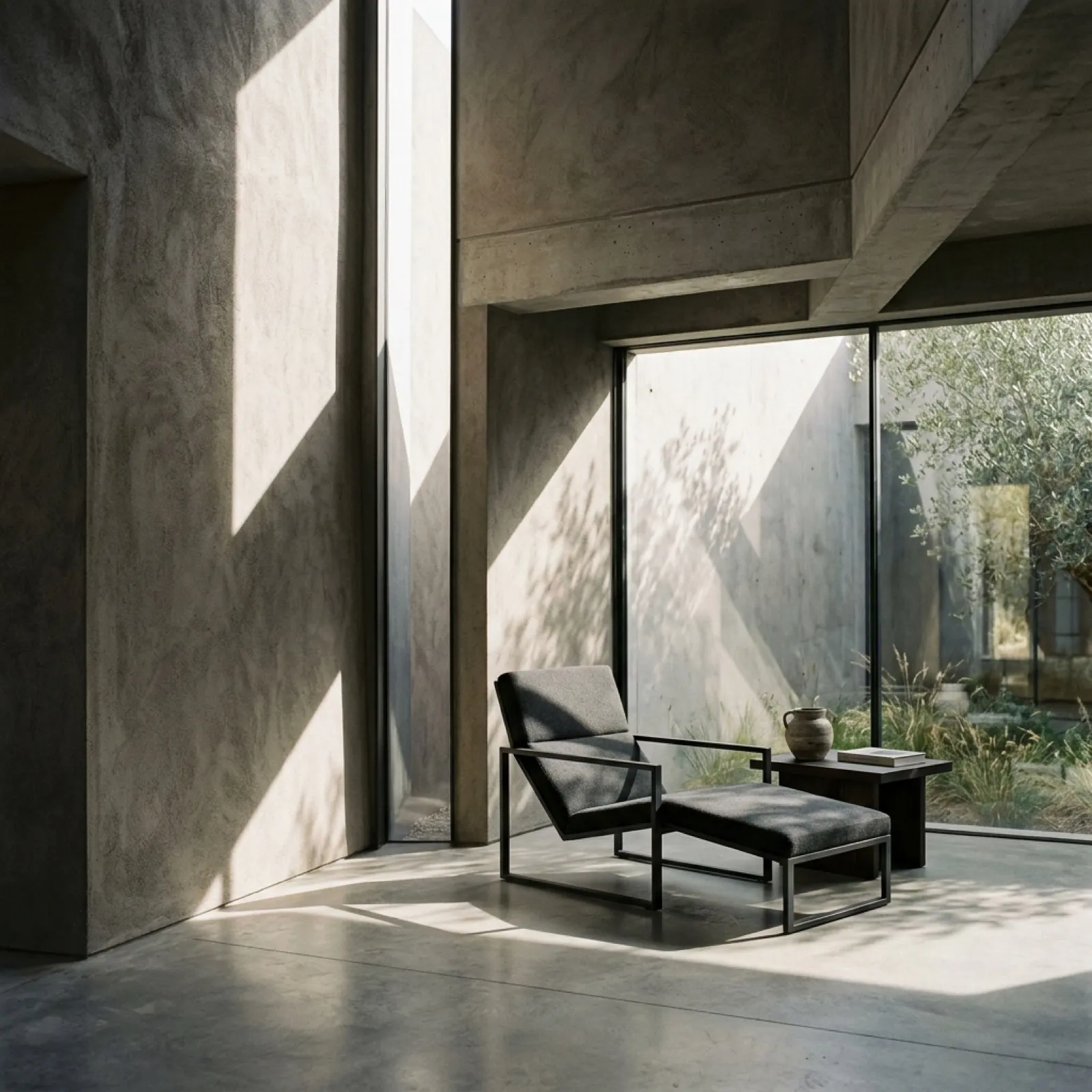
From placeholder to authored project in four decisions.
The work was not to invent a second Feldhaus. It was to finish the one that had already appeared.
- 01
Keep the atmosphere
The dark image world, measured spacing, restrained materials, and archival structure already belonged together.
- 02
Define the fictional practice
Feldhaus became an architecture studio that researches, plans, and builds useful spatial frameworks rather than decorating a finished lifestyle.
- 03
Draw the mark it never had
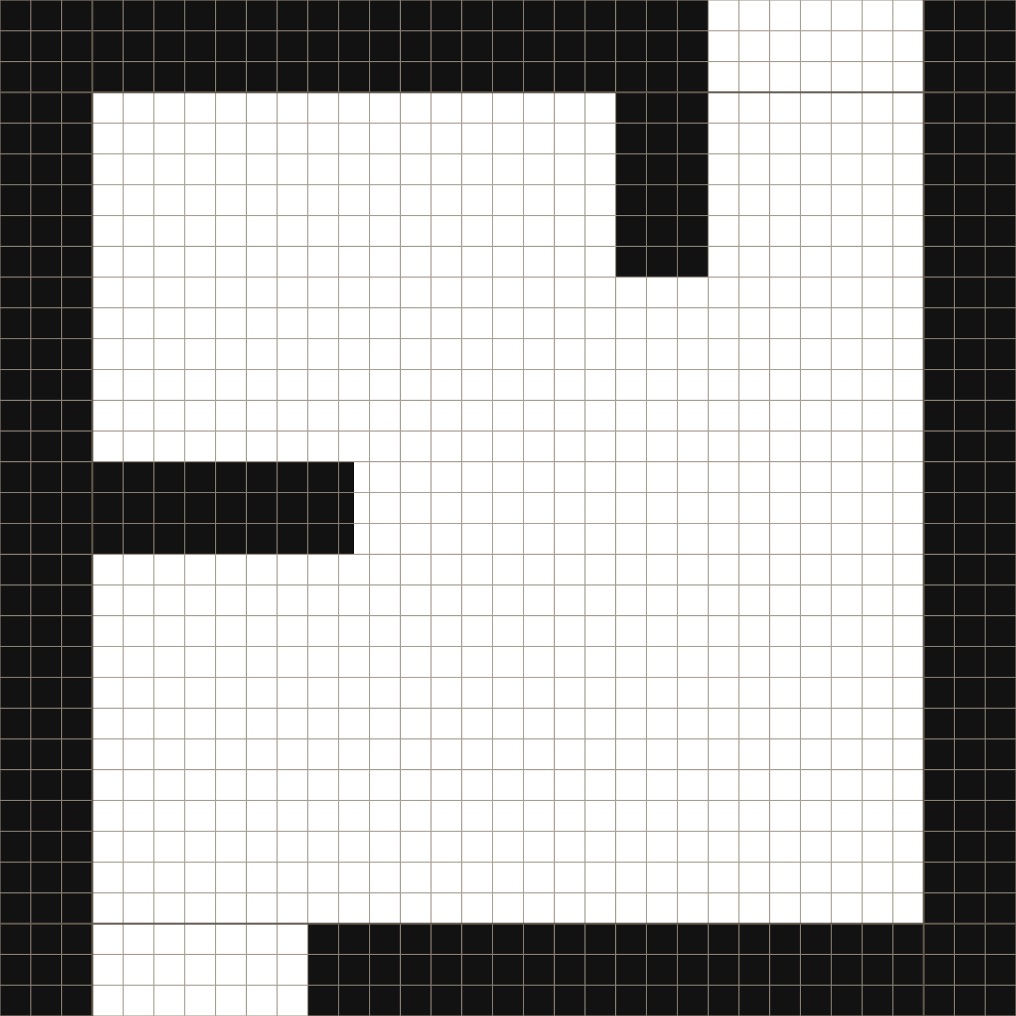
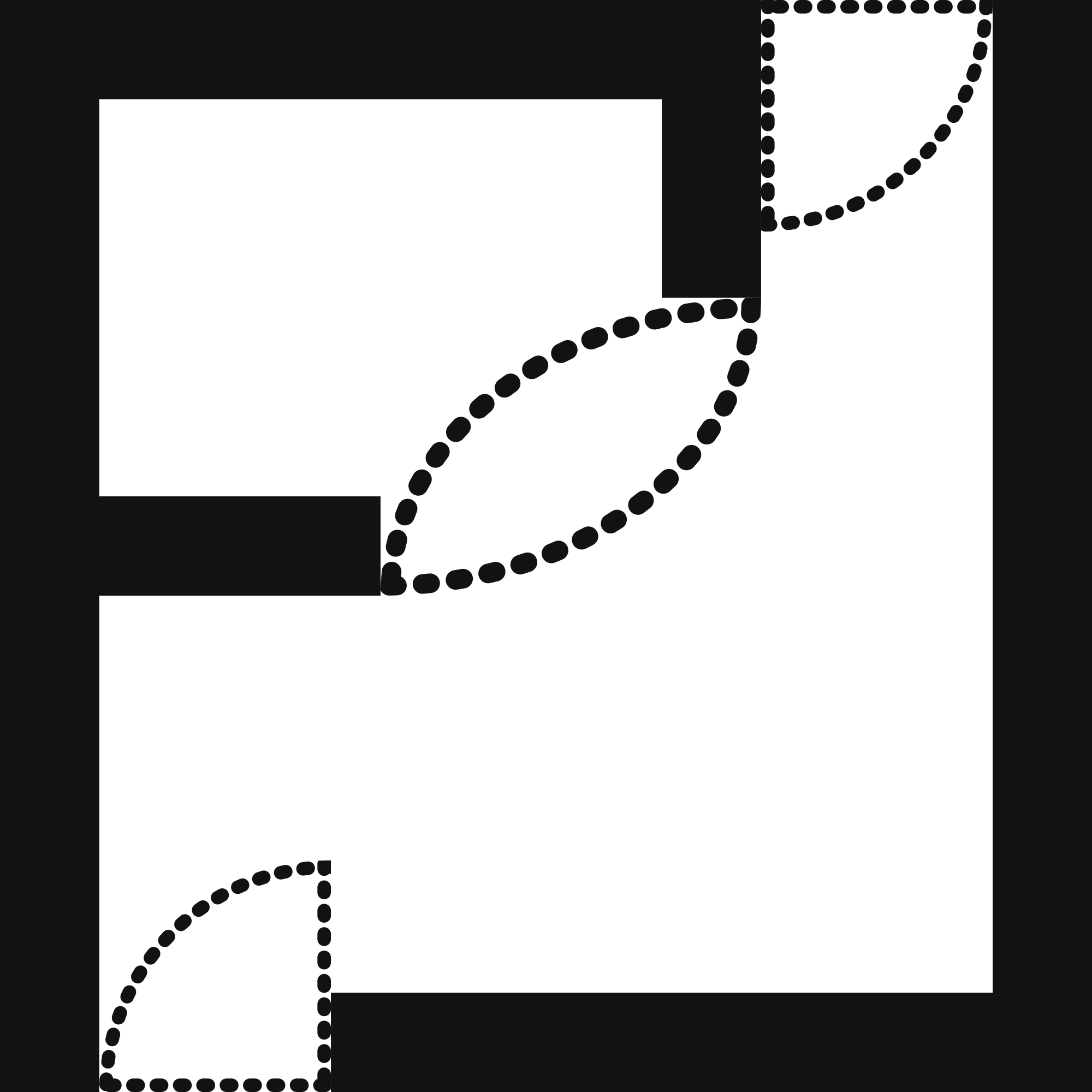
DIYRO KIWIYA designed the identity: an F held inside an open room—a useful enclosure that stays incomplete until someone inhabits it.
- 04
Refine instead of replace
The website kept its architectural character while losing the custom cursor, fake studio signals, generated textures, and performative technical language.
Feldhaus provides the canvas.The client provides the life.
The fictional studio researches how people move, plans what a space must support, and builds the useful structure that needs to endure. Colour, objects, rituals, and personality are deliberately left open to the people who inhabit it.
A website with no mark is a book with no cover.
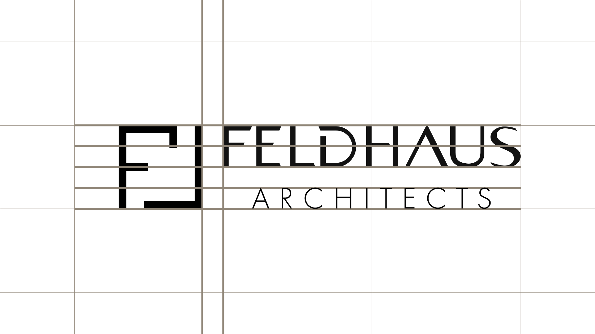
Antigravity produced the world: pages, images, atmosphere. What it never produced was an anchor. DIYRO KIWIYA designed that anchor and everything holding it steady—the mark, the FELDHAUS ARCHITECTS lockup, the construction both are drawn on, and the pattern taken from the mark itself.


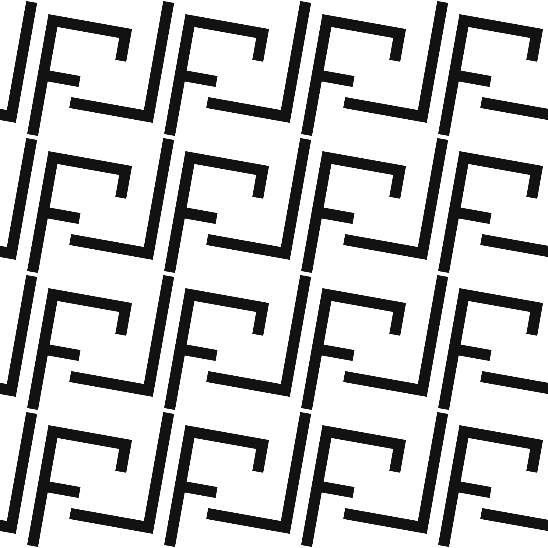
Zero chromatic decoration.
Five values carry the whole system. Colour never decorates here—it separates ink from surface and marks the line between them. Everything expressive is left to material, light, and photography.
- Charcoal
#0B0B0DThe page itself—the dark the work sits in.- Soft black
#121212Panels and plates lifted off the page.- Warm grey
#AAA59DBody copy, captions, and annotation.- Stone grey
#C3BFB8Numerals, rules, and the active state.- Paper white
#F3F2EFHeadings, and the mark reversed out.
Draw the room, not the life inside it.
Architecture studios sell signature—the practice’s personality is the product. Feldhaus withholds personality on purpose, which in this category reads as either discipline or emptiness. Five decisions exist to make it read as discipline.
- Form carries the idea
- A thirty-three unit square with three-unit strokes and two gaps: an enclosure that will not close.
- Typography recedes
- One geometric sans for everything human, one mono for everything measured. No third voice, and no serif anywhere in the system.
- Colour refuses to speak
- Five achromatic values. Colour is structure—ink, surface, line—and never an accent.
- Image does the feeling
- Photography carries all the warmth: light, plaster, timber, dust. The system stays cold so the images can be warm.
- Voice annotates
- Captions read as drawing callouts: name the mechanism, not the feeling, then stop. Motion is reveal only—nothing celebrates.
Two faces: one human, one measured.
- Outfit — display and body
- Weights 300–600, tracking −0.02 to −0.035em at display sizes. A geometric sans with no personality to spend—which is the point.
- JetBrains Mono — annotation
- Weights 300–500, set 0.60–0.72rem, uppercase, tracking +0.08 to +0.20em. Reserved for measured things: captions, metadata, numerals, labels—never for atmosphere.
- The wordmark is drawn
- FELDHAUS ARCHITECTS is outlined vector, not set type. It is never re-typeset in Outfit, and its geometry is never redrawn.
Polish meant removal, not replacement.
The generated website already knew how Feldhaus should feel: dark, tactile, quiet, image-led, and precise. Its full-bleed hero, horizontal project sequence, archive grid, and project drawer were retained as the project’s visual authority.
The refinement installed the new identity, restored the native cursor, replaced synthetic material spheres with image-backed references, removed the fictional inquiry form and false location, simplified inflated labels, and made the project’s fictional status visible without weakening the experience.
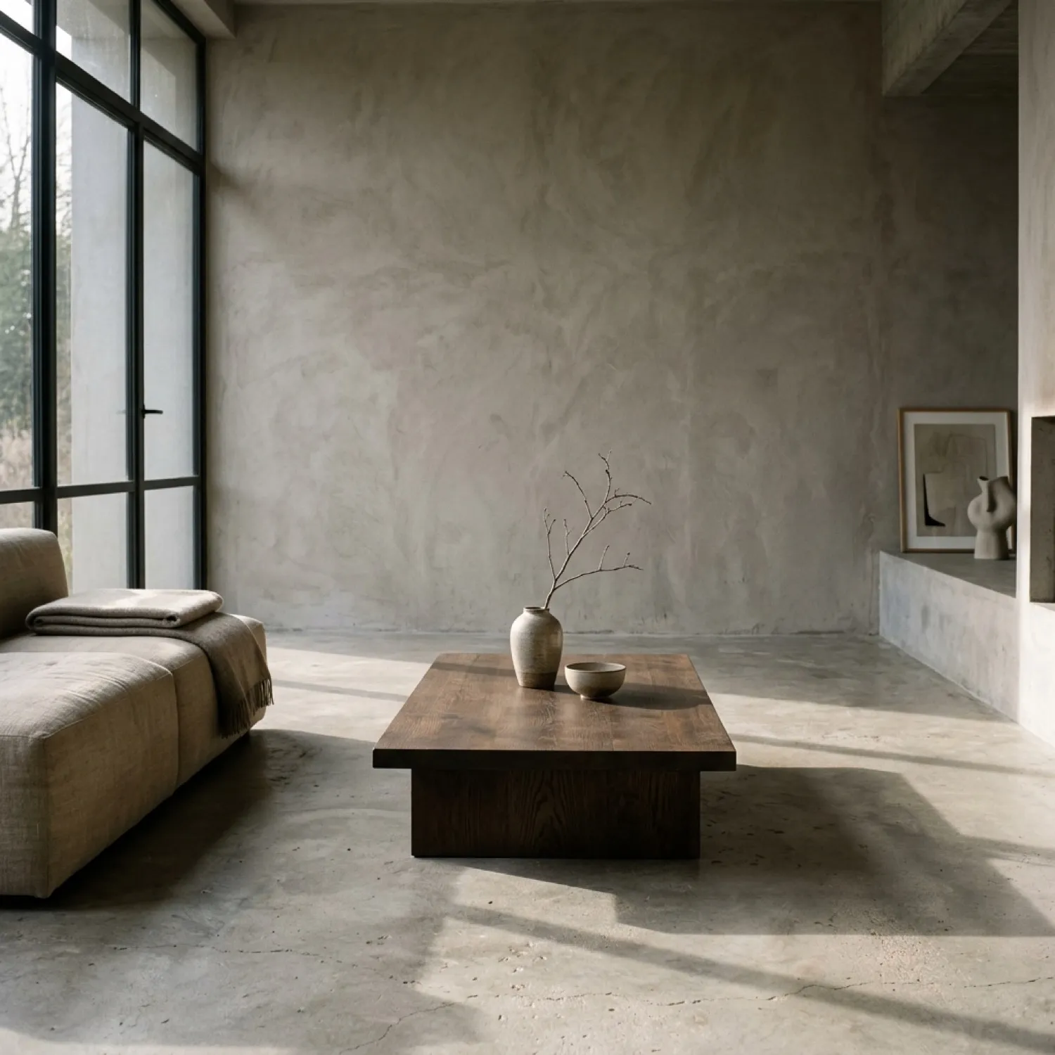
Four corrections made the website feel authored.
- 01
Use the real identity
Typed substitutes disappeared. The designed logo now carries navigation, the hero, the footer, the case page, and the favicon.
- 02
Let interaction stay native
The generic precision cursor was removed. Clear focus states, reduced-motion support, and predictable controls now carry the interaction.
- 03
Show material through images
Generated CSS texture balls became architectural crops, so material is understood through light, scale, adjacency, and use.
- 04
Replace simulation with context
A fake contact portal became the project’s actual origin and credits. The visitor can understand the fiction, then open the standalone experience.
Imagery builds the world. Labels keep it honest.
The fictional studies are not evidence of architectural commissions. They are the visual material through which the Feldhaus identity, archive, and interface are tested.
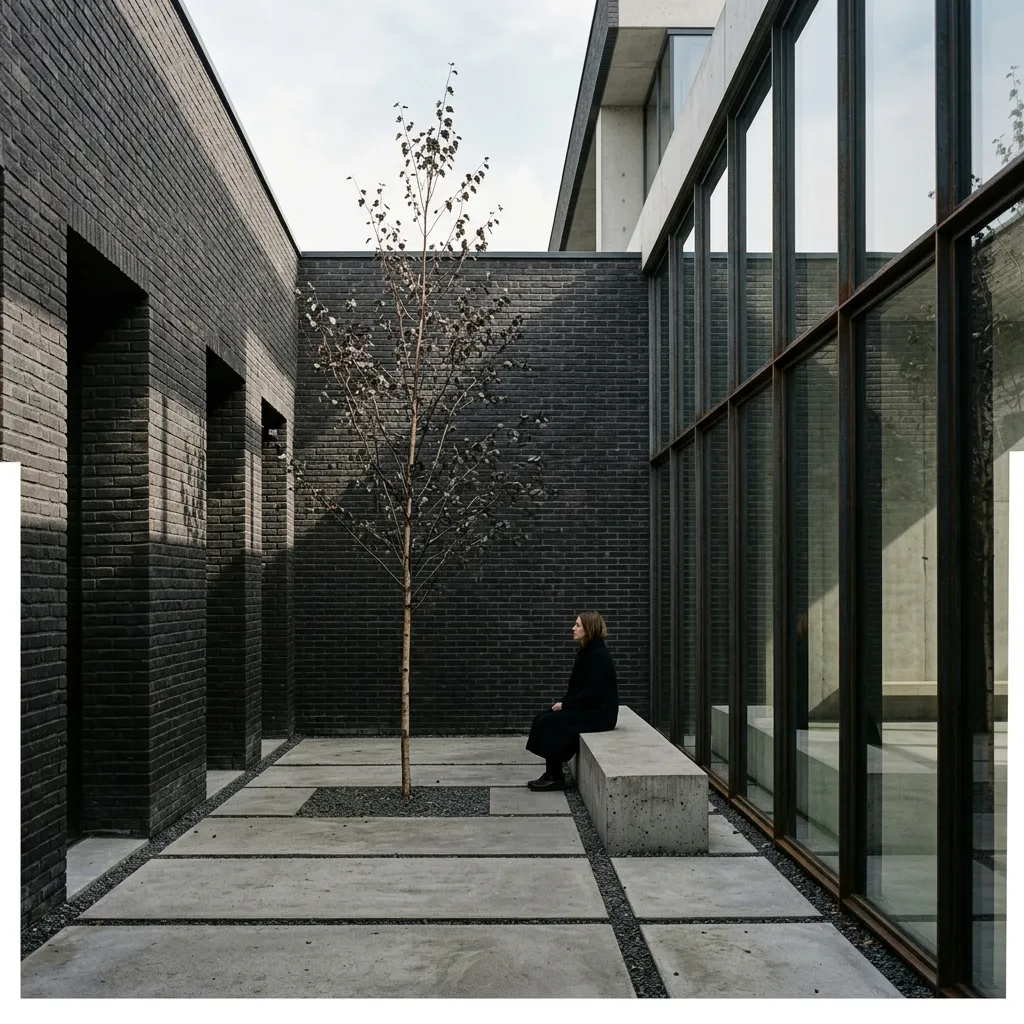
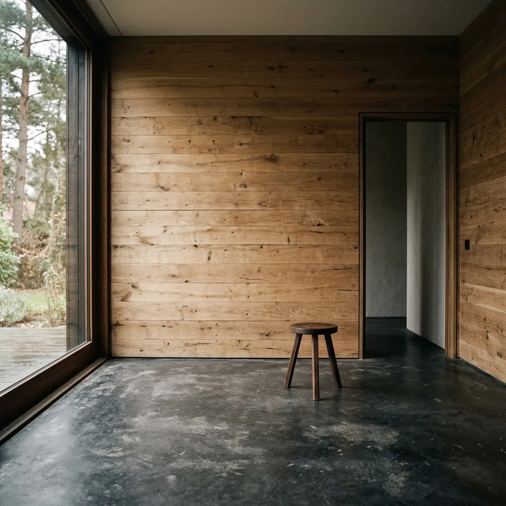
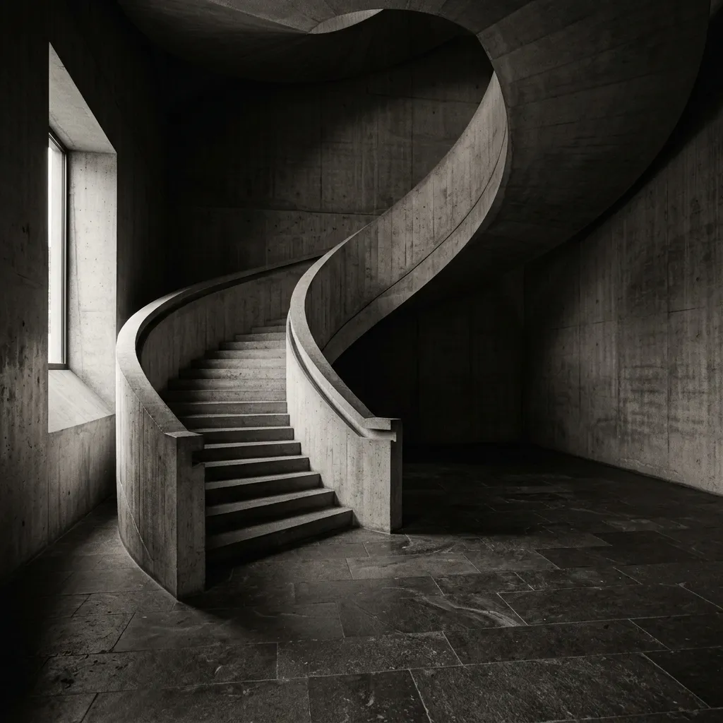
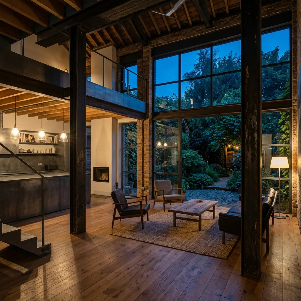
A resolved public concept, not a simulated commission.
- 01Feldhaus logomark, FELDHAUS ARCHITECTS lockup, construction, and pattern
- 02Fictional practice positioning and architectural-canvas proposition
- 03Responsive standalone architecture-studio website
- 04Eight-study archive with accessible detail drawer
- 05Image-backed material register
- 06Multilingual Astro portfolio case study
The artifact is real. The architecture is fictional.
The working evidence is the vector identity—mark, lockup, construction, and pattern—together with the responsive standalone website, its selected-study slider, eight-study archive, material register, and accessible project drawer.
There is no client brief, commissioned architecture practice, verified building, commercial result, testimonial, or live inquiry service to claim. The value of the case is the transformation from generated placeholder to authored design system.
Enter the fictional practice.
The website is the project in use: the identity, fictional studies, material language, and refined interactions working as one architectural world.
Open the Feldhaus websiteThe disciplines shaping this result.
Liked the project?
Tell me what you are building. I will reply with an honest fit check and a practical first scope.